Giving Day is April 23, 2026!
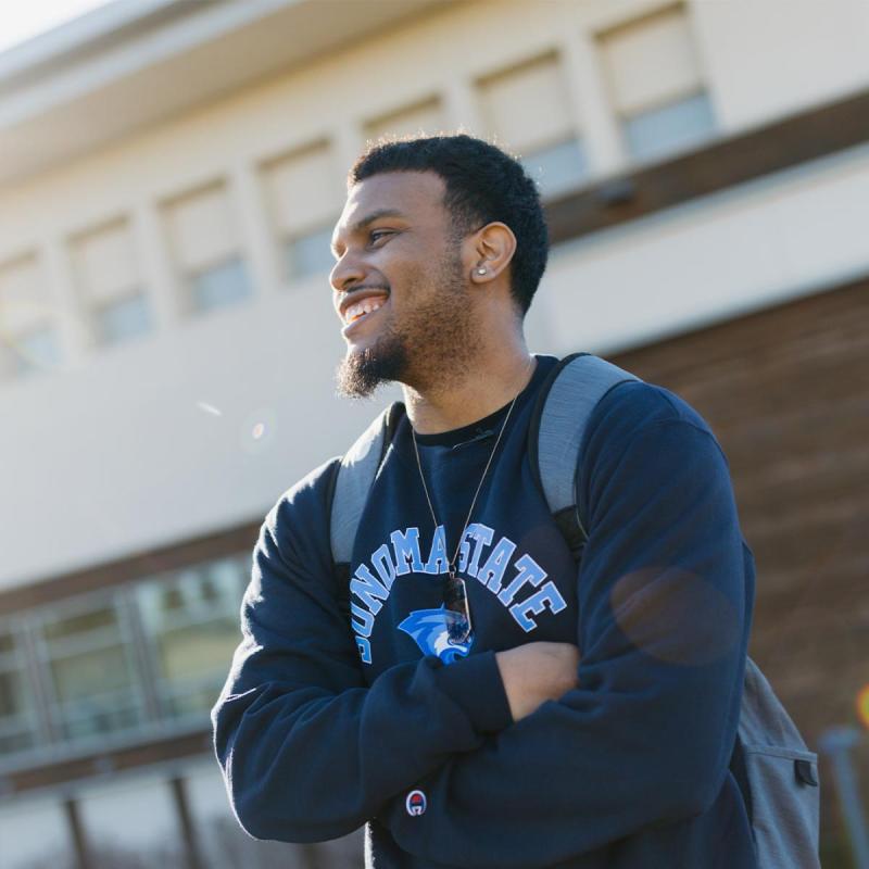
On April 23, 2026, the Sonoma State community will come together for Giving Day, a 24-hour celebration of impact, pride, and possibility! It's a powerful moment when students, alumni, faculty, staff, and friends unite to support what makes Sonoma State so special.
Discover Sonoma State
Explore Your Future
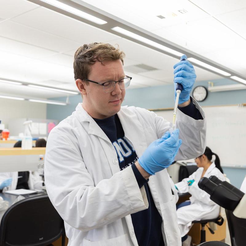
Discovery is at the heart of everything we do at Sonoma State University. Discover a community that supports your goals, inspires your passions, and fuels your purpose. Discover hands-on learning, meaningful connections, and opportunities that prepare you for success in college and beyond.
Start your journey today and discover how Sonoma State can help you grow your potential, shape your future, and launch your career.
Northern California Within Reach
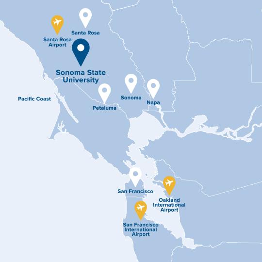
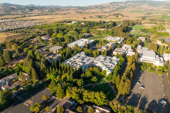
Nestled in the heart of Northern California, just an hour north of San Francisco and 45 minutes from the Pacific Ocean, Sonoma State University offers an ideal blend of natural beauty, academic excellence, and a welcoming community.
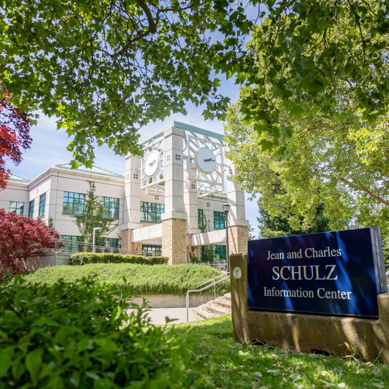
Located in the friendly city of Rohnert Park, Sonoma State is surrounded by rolling hills, majestic redwoods, and world-renowned food and wine. Here, students discover endless opportunities for outdoor adventures, cultural experiences, and personal growth. Sonoma County isn’t just a place to study, it’s a place to thrive, build connections, and feel at home.
Sonoma By The Numbers
At Sonoma State University, excellence goes beyond the classroom. Recognized among the top California State University (CSU) campuses, SSU stands out for its strong graduation rates, student success, and vibrant campus life, empowering students to thrive on campus and in their future.
Explore Sonoma State
Discover what makes Sonoma State unique!
Life at Sonoma State
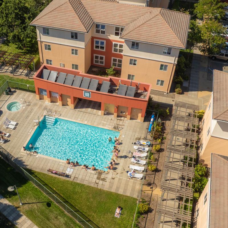
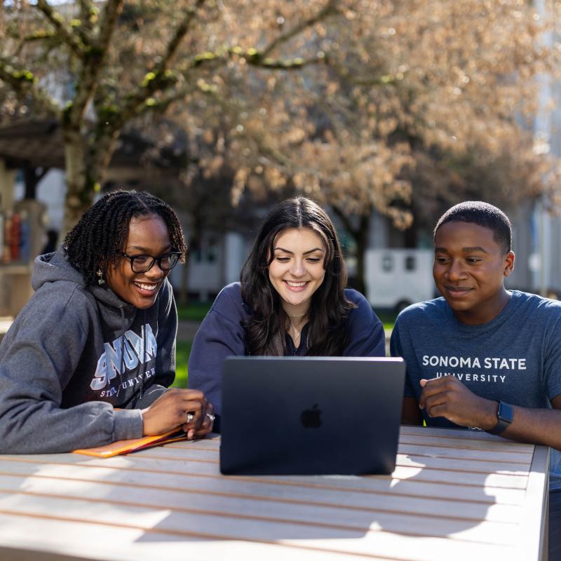
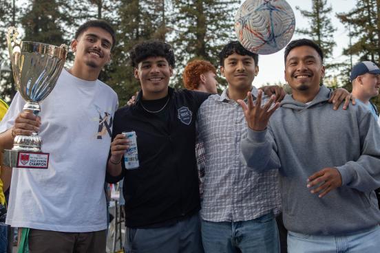
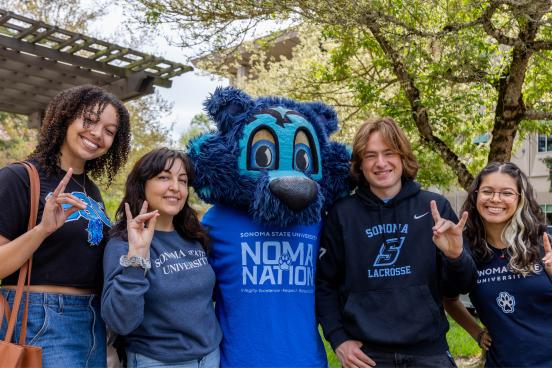
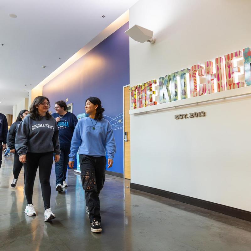
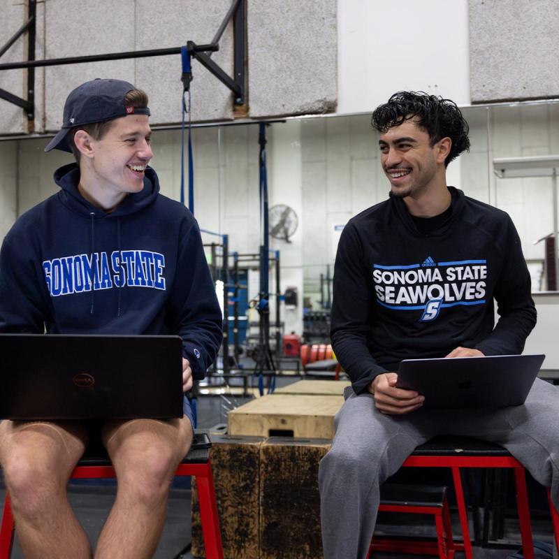
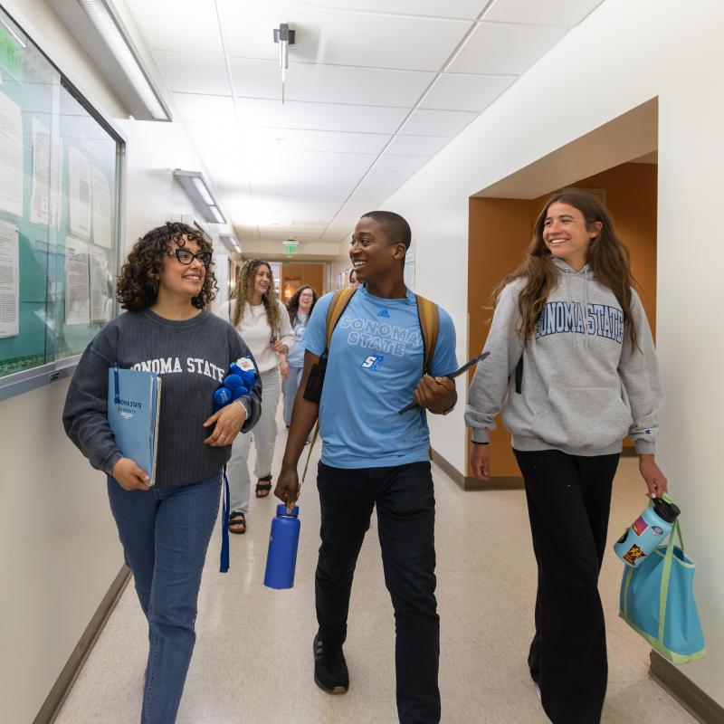
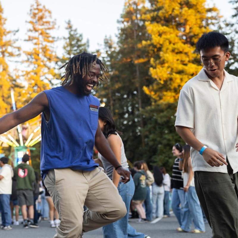
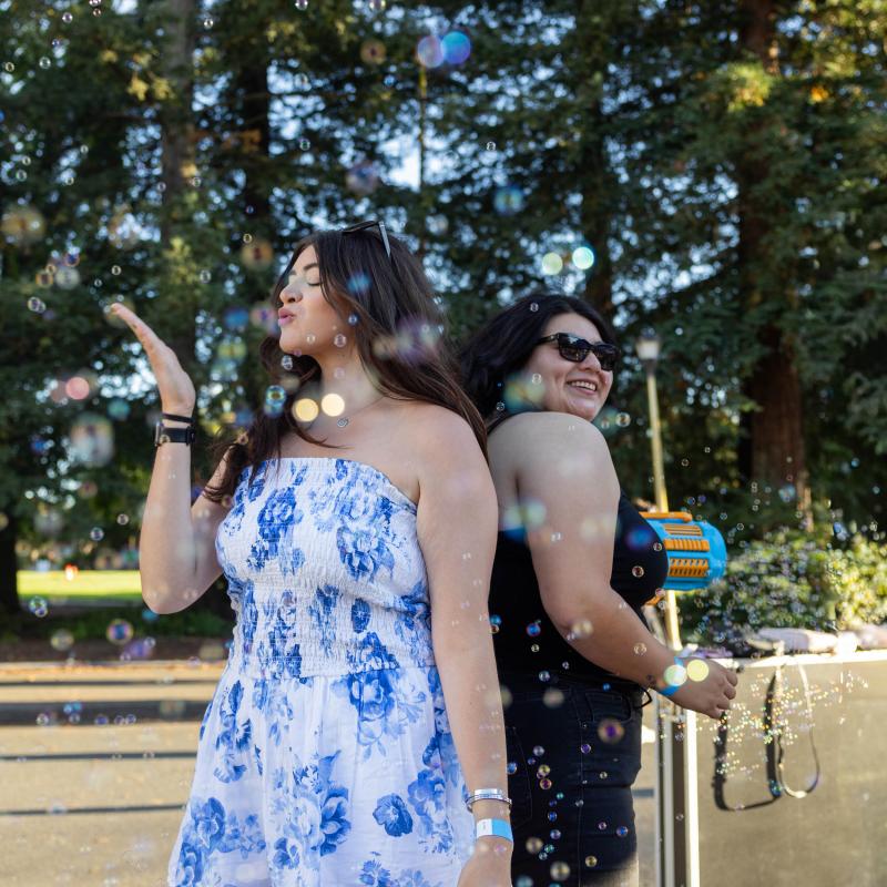
Experience the energy, connection, and pride that make Sonoma State a place to call home. From campus traditions and student events to everyday moments with friends, life at SSU is filled with opportunities to get involved and make lasting memories!
Campus Life
With more than 100 student clubs and organizations, there’s a place and a community for everyone. Whether you’re interested in fraternities, sororities, special interest clubs, cultural groups, community service, or another passion, you’ll find countless ways to explore your passions and make your mark at SSU.
Traditions
From Big Nite to Big Blue Weekend to Commencement, Sonoma State celebrates the moments that bring our Seawolf community together. Whether it’s the excitement of welcoming new students, the pride of honoring our graduates, or the joy of reconnecting with friends and classmates, these traditions embody the spirit, pride, and connection that make SSU truly special.

Explore Our Programs
An Education for Everyone
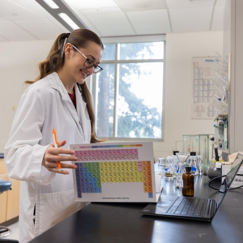
Discover your path to success with an education designed to guide you wherever your journey takes you.
Events
Discover what’s happening on campus and be part of the excitement! From student activities, career fairs, guest speakers to cultural celebrations and group fitness classes, there’s always something going on at Sonoma State.
26

Weill Hall, Green Music Center
27

All Culinary Services Venues
28

Weill Hall + Grounds, Green Music Center
News
Stay connected with the latest stories, achievements, and moments that make Sonoma State shine. Discover how our students, faculty, staff, and alumni are making a difference on campus and beyond.
Ready For What’s Next?
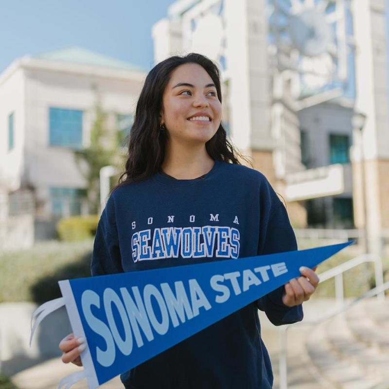
Take the next step and become part of the Seawolf community.


